Still Out of Scale on State Street
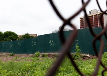
In case you’ve been wondering why Robert Scarano rubs people the wrong way, this eyesore at 326 State Street in Boerum Hill should speak for itself. When we posted about this place back in January, we wondered how he was able to get 8,833 square feet of space approved. The answer seems to be that…


In case you’ve been wondering why Robert Scarano rubs people the wrong way, this eyesore at 326 State Street in Boerum Hill should speak for itself. When we posted about this place back in January, we wondered how he was able to get 8,833 square feet of space approved. The answer seems to be that this is gross square footage and not actual square footage that DOB cares about. Size aside, however, the fact remains that this building is just a giant “F— You” to the community. In making zero attempt to respect its surroundings, it is a poster child for the need to strengthen and expand landmark boundaries. The poor neighbors.
326 State Street: When Too Much FAR Is a Bad Thing [Brownstoner] GMAP P*Shark DOB




I would rather have this building than the fedders abominations springing up near the clinton hill/bed stuy border.
I think it looks pretty cool, at least on the pictures. Certainly better than the two buildings surrounding it.
i agree, the facade comes out too far, but yay for modern design. wait a minute; nobody asked for my opinion – i’m just throwing it out there all on the unsolicited tip. holy smokes! lady bird johnson died!
dont worry, it wont be out of scale much longer. That parking lot across the street is going to become a tower any day now.
As we just noted on the Franklin Avenue thread, context is everything. In the right setting, we’d have no bone to pick with this building. But on this block, it’s completely offensive.
If y’all like this one so much, please walk over to 23rd St between 4th and 5th Aves. Almost identical design, different finishes.
Brownstoner posted on it a few months back. Check the archives for 211 23rd St. Everyone had a field day on that property is well.
Too bad it’s not sold out yet. That’s the funny thing about having your plans audited with potential revocation.
I wish Scarano would come rape Bushwick. There’s a lot right next to me, please, PLEASE come build something out of scale!
I think there is plenty wrong with this building. For one thing it does not line up with its neighbors, it plunks itself down, like a commercial building, right on the sidewalk with no seapartion between public and private space. Re-inforcing the commercial look are the windows which look like they are from the entrance to a shopping mall. The massing is hyper-kinetic. What’s with all those set backs and pop-ups? It looks to me like a some sort of sales pavilion that is trying to lure customers in to buy the latest appliance line or something.
It has no attributes of a residential building which is one of the many reasons it looks so out of place on this residential street.
So to sum up it is wrong in terms of its scale, its placement on the site, its massing and its fenestration. Other than that, it’s great. I hope the tenants enjoy the central air, because they are going to need a great deal of it all year round.
There are two issues: this building and Scarano generally.
The debate over whether Scarano is merely “bending” or creatively interpreting the zoning rules or doing something far more egregious is a tired one that has been played out on many sites. I would suggest next time someone wants to prolong what should be a settled debate in this area with a comment defending Scarano’s integrity, I suggest you please post along with your comments documentation of Scarano’s self-certification privileges. Oh wait . . .
As for this building, it merits a debate without rehashing all the past stuff about Scarano. My view, I don’t like it, not because it’s modern, but because it breaks the building line in the front and overshadows its neighbor. If the building were set back with the others, that would solve part of the aesthetic problem. Beyond that, hard to tell how it will fit in because the facing isn’t on. Sometimes the juxtaposition works and sometimes not.