The Insider: Historic Red Hook Shell Revived as Family Home Plus Rental
= Four brick walls with some remnants of floor joists and staircases — that’s all that was left of a 25-by-50-foot three-story building on Coffey Street, erected in the 1860s by the Atlantic Dock Company as workers’ housing. “You couldn’t even walk around in most of it,” recalled architect Rafe Churchill, who was hired to…
=
Four brick walls with some remnants of floor joists and staircases — that’s all that was left of a 25-by-50-foot three-story building on Coffey Street, erected in the 1860s by the Atlantic Dock Company as workers’ housing.
“You couldn’t even walk around in most of it,” recalled architect Rafe Churchill, who was hired to help the building’s new owners convert the two upper floors into a home for their family of four, with a rental unit beneath. “We had to use a ladder to get up to the second floor.”
The building had been long abandoned when the couple — she’s a baker and he is an educator who runs a farm in the Rockaways — bought it a few years back and hired Sharon, Connecticut–based Churchill, whom they’d met at a party. Churchill’s practice is largely country homes for city people, he said, but because he’d lived in Brooklyn himself for 20 years, he had a special feel for the project and his aesthetic seemed a good fit.
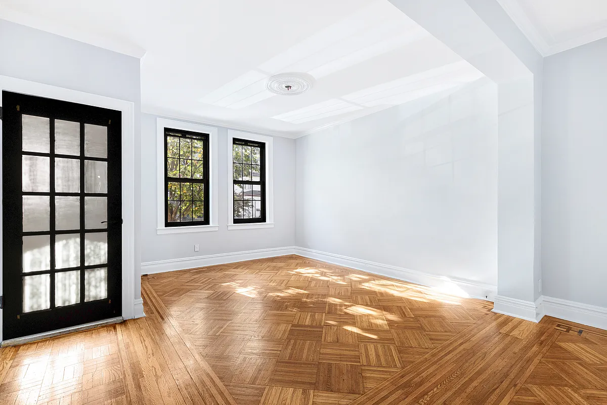
The architect approached the job “more like a loft,” he said. “It was wide open and empty; we didn’t even have any window trim to reference. The only thing we had to honor was the existing flooring, and we were able to salvage a fair amount” of it. (The rest of the flooring was purchased as reclaimed heart pine from the Hudson Company in Pine Plains, New York.)
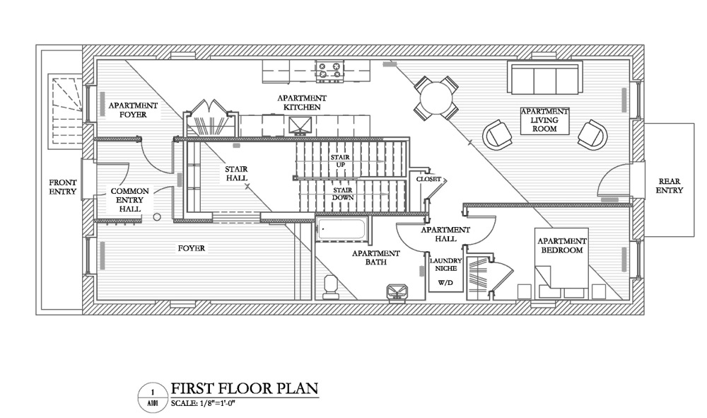
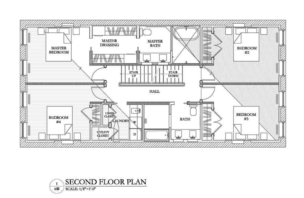
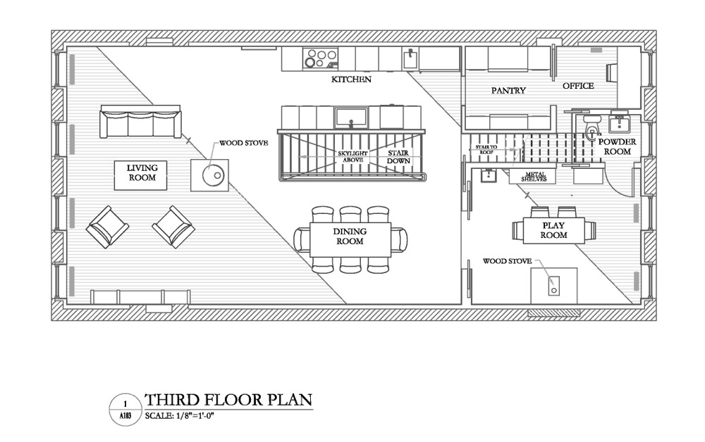
Ultimately, they fit four bedrooms plus two full baths; a laundry and a dressing room on the second floor; and a living/kitchen/dining, open except for a bathroom and pantry at one end, on the top floor, which offers tremendous views of the harbor. The rental unit occupies about two-thirds of the ground floor; there’s also a spacious mud room for the owners on that level, plus gym and storage in the basement.
The windows had been boarded up with plywood, and Churchill decided on 9-over-9 double-hung sashes. Based on the size and proportions of the window openings, he said, “that seemed the best composition.”
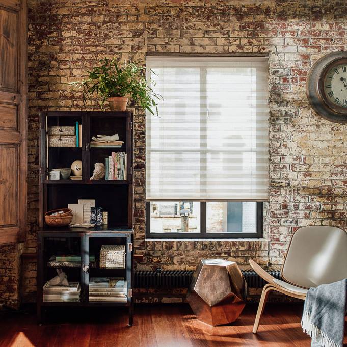
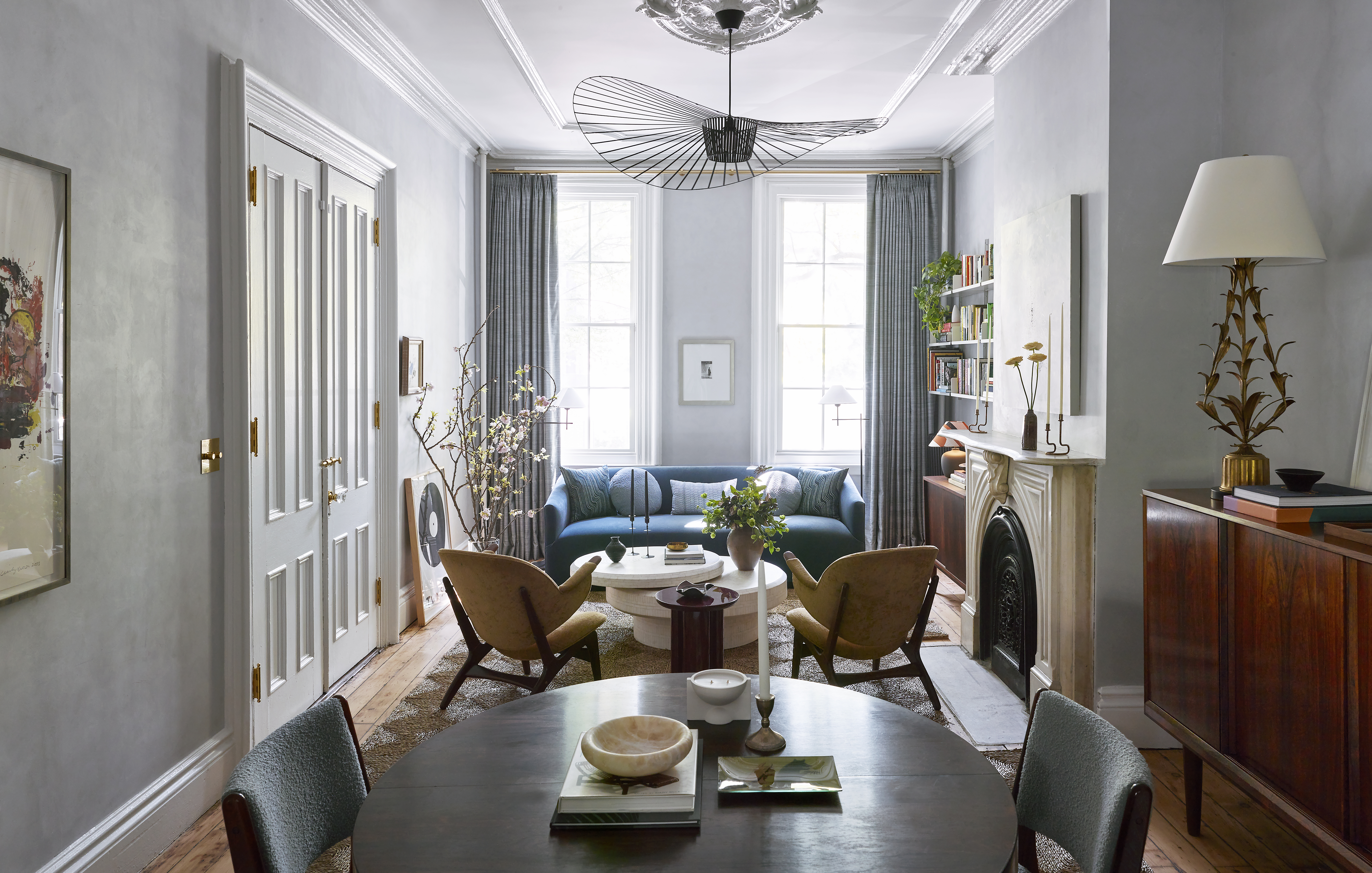
The plaster walls have a natural aggregate finish — “not painted at all, almost like a stucco.” Trim colors are from Farrow & Ball. Cast iron radiators are likewise unpainted. “We received them with dark gray primer and that’s how we left them,” Churchill said. “All the brass fittings and elbows are exposed. We wanted texture.”
His clients were attracted to the neighborhood because it’s not an overly finished streetscape, Churchill said. “The goal was to create beautiful interior spaces, and although some of the finishes are at a high level, to retain the natural beauty of the raw plaster, exposed radiators and reclaimed flooring, You could see a project like this take a turn by concealing the radiators or putting in new flooring. Then it would look like a lot of other places, and that’s not really what we do.”
The contractor was Creative Renovations of Brooklyn; interior design and furniture selection by Heide Hendricks.
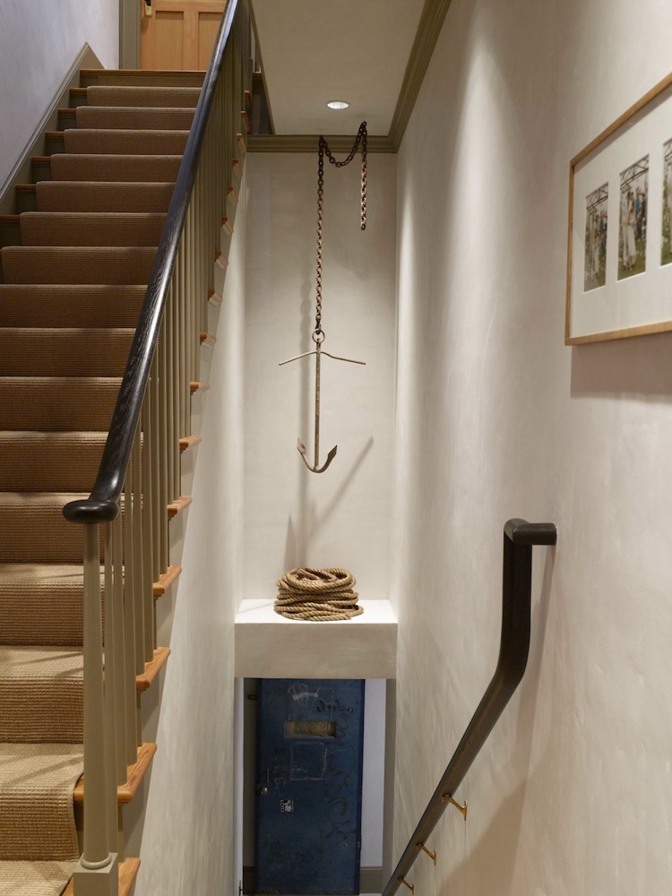
From the entry, stairs lead down to the basement and up to the owner’s quarters on the second and third floors.
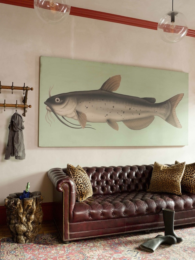
The ground-floor mudroom is spacious enough for a Chesterfield sofa.
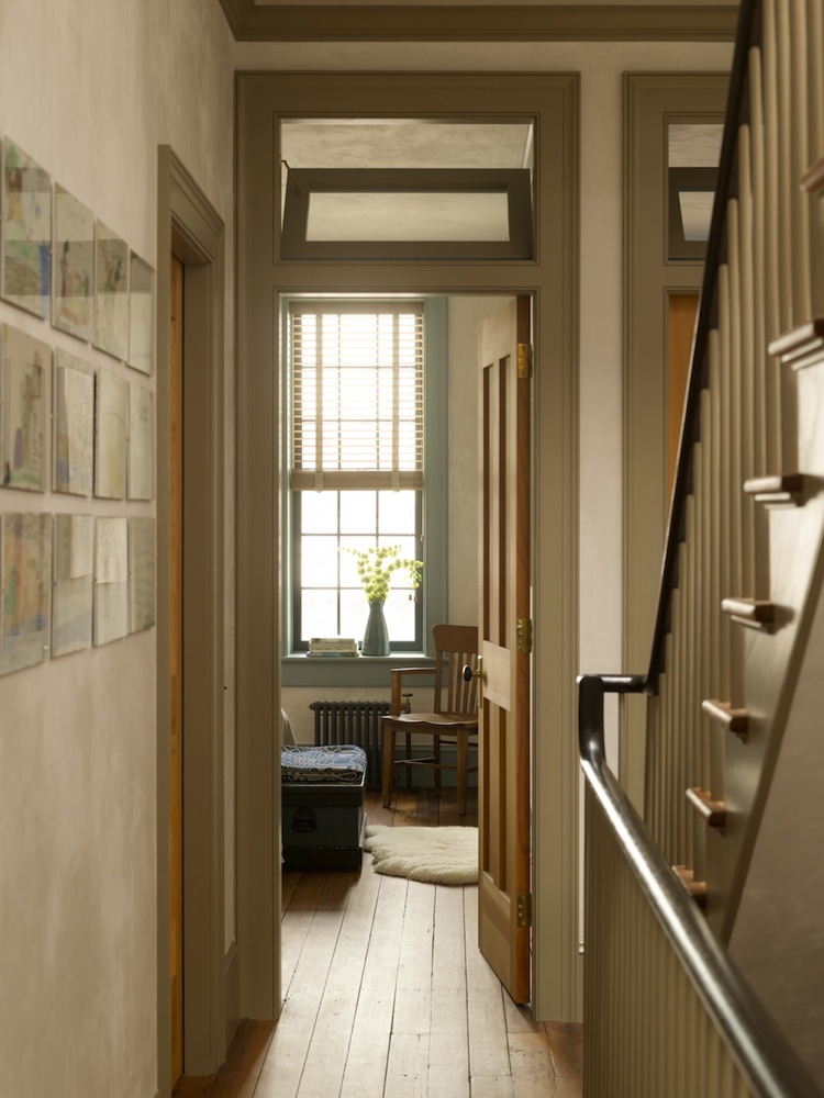
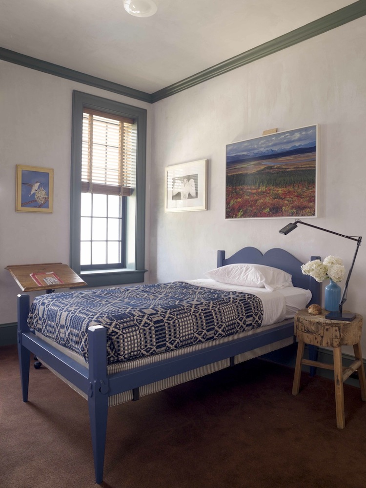
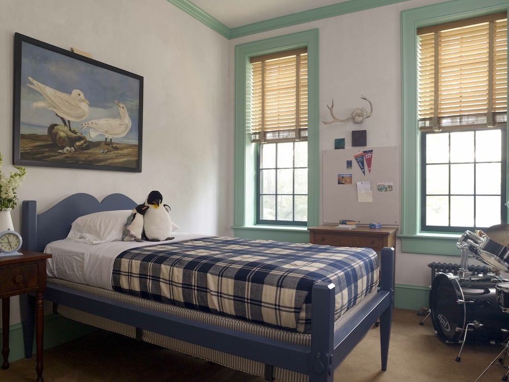
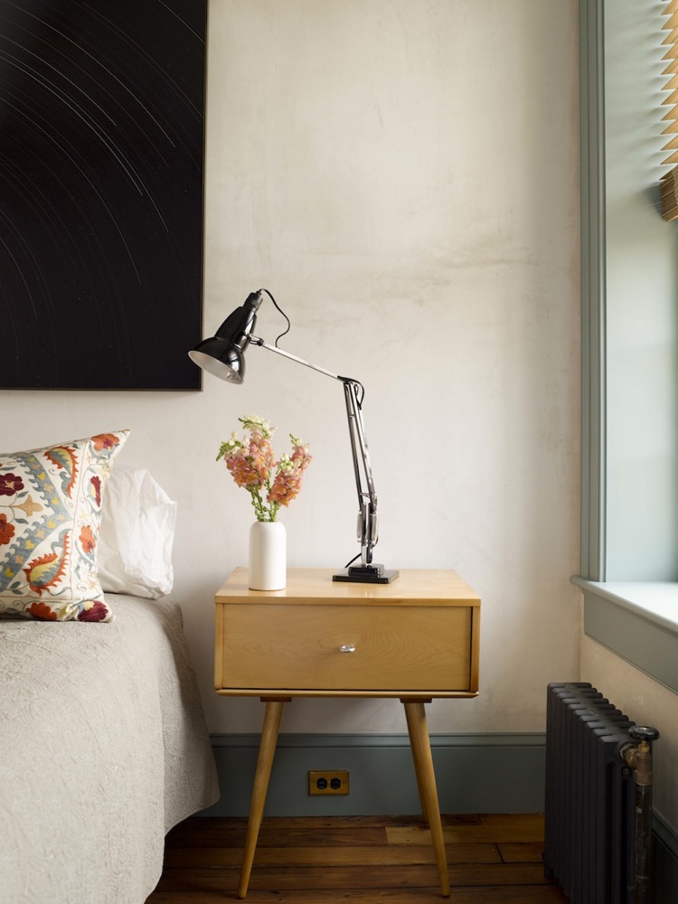
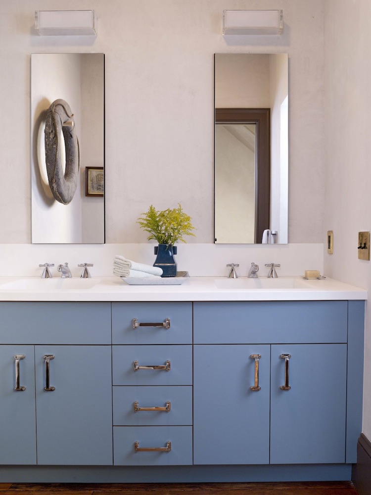
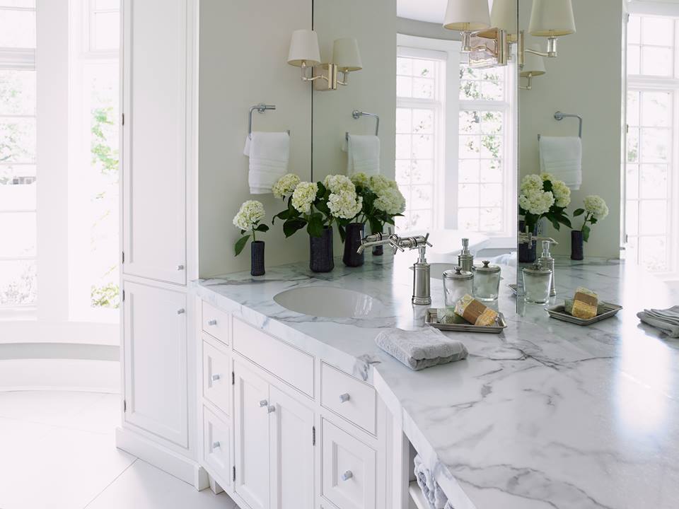
The second floor has four bedrooms, decorated in a modern country idiom, and two full baths (the kids’ bath is above). Plumbing fixtures came from Waterworks and Kohler, with Dornbracht and Grohe faucets. The Simpson Door Company made new interior doors. Bamboo window shades came from the Shade Store.
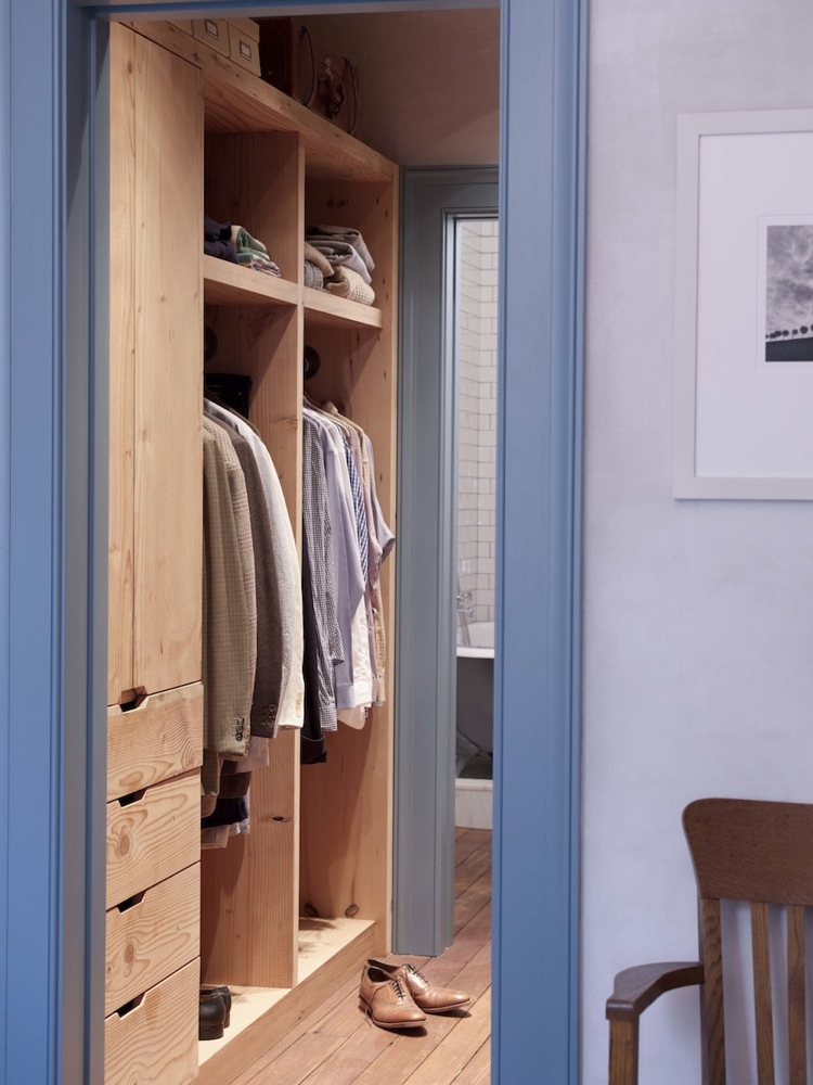
Cabinetry in a dressing area attached to the master bedroom was constructed using wood salvaged from damaged floor joists, as was a firewood storage cabinet in the top-floor living area.
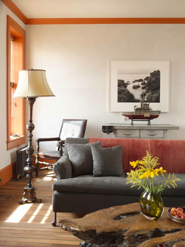
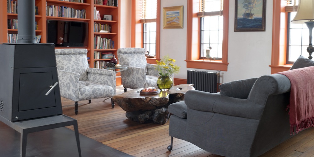
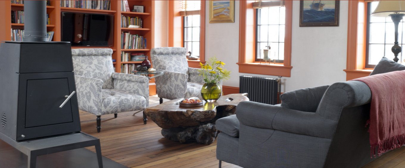
The living room and other common areas were situated on the top floor, which has the best water views. A wood stove in the living area, seen in the top photo, is from Wittus-Fire By Design.
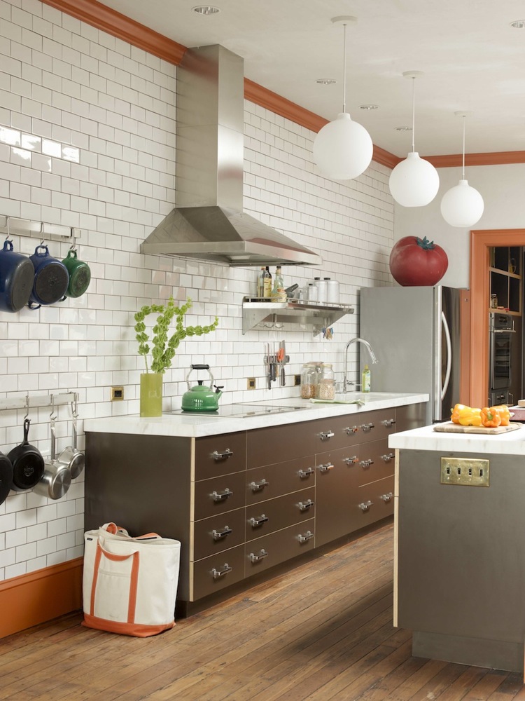
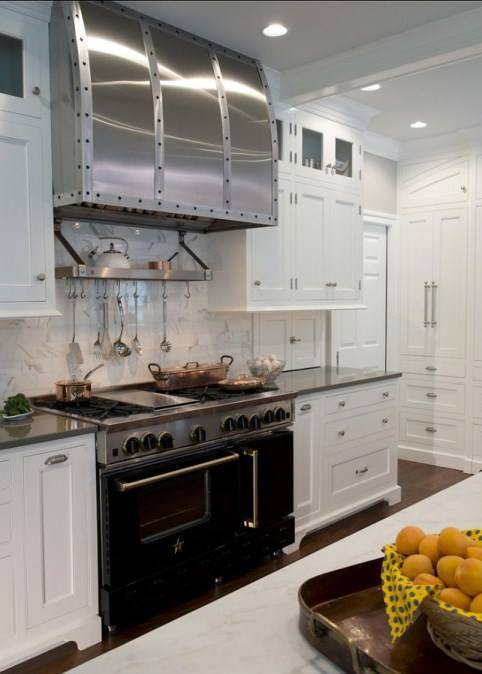
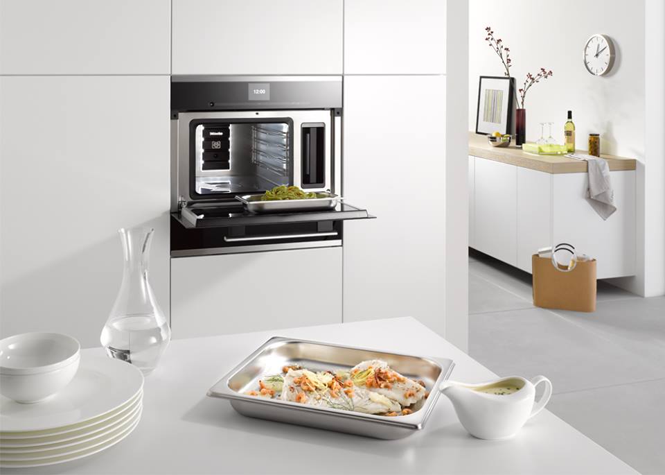
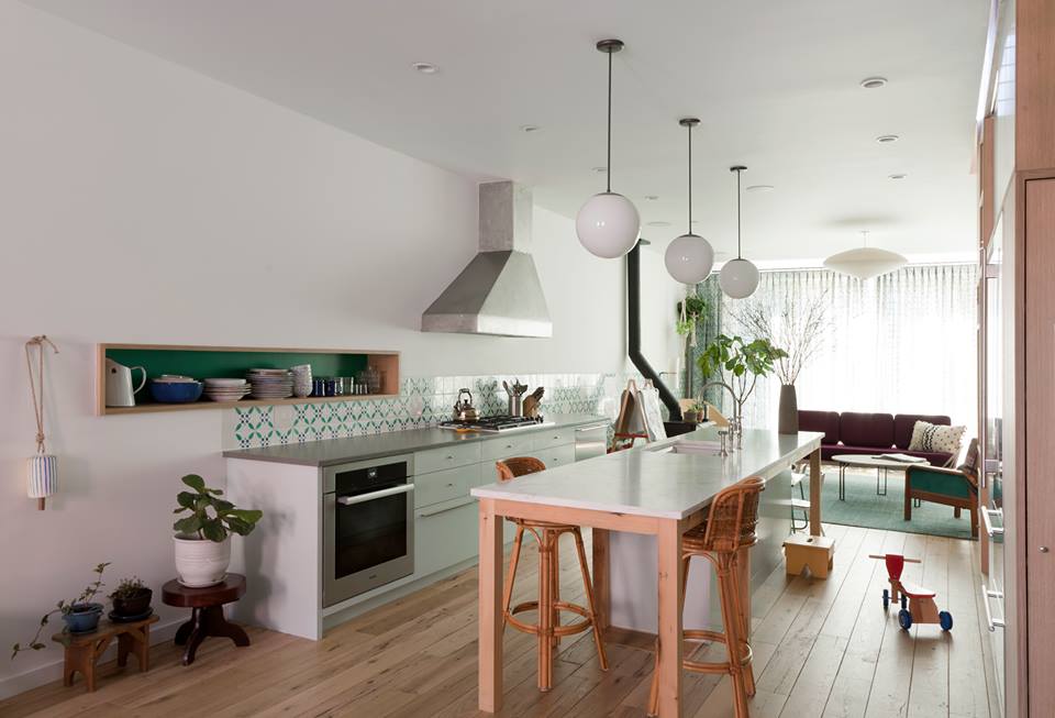
The open kitchen features custom cabinets made of Baltic birch multi-laminate plywood, with edges left exposed, and a brown Formica veneer. Big industrial-type drawer handles were used in the bathrooms as well. The flooring here is original to the house. Subway tile is from Ann Sacks; appliance sources include Electrolux, Miele, KitchenAid and Blue Star.
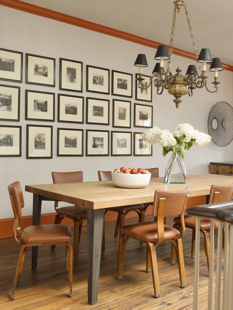
The architect designed the custom dining table.

[Photos by John Gruen]
The Insider is Brownstoner’s in-depth look at a notable interior design/renovation project, by design journalist Cara Greenberg. The stories are original to Brownstoner; the photos may have been published before. Got a project to propose for The Insider? Please contact Cara at caramia447 at gmail dot com.
Related Stories
The Insider: Architectural Ingenuity Abounds in Red Hook Row House Reno
The Insider: New Row Houses in Red Hook
The Insider: Radical Reno in Red Hook
Businesses Mentioned Above
Email tips@brownstoner.com with further comments, questions or tips. Follow Brownstoner on Twitter and Instagram, and like us on Facebook.
[sc:daily-email-signup ]




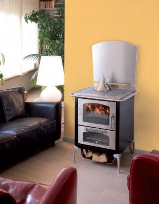





I think this is lovely. First question that springs to mind, though – is that stove legal? I thought it was only grandfathered wood-burning fireplaces that were permitted, and obviously this isn’t one of those.
I think this is lovely. First question that springs to mind, though – is that stove legal? I thought it was only grandfathered wood-burning fireplaces that were permitted, and obviously this isn’t one of those.
Don’t care for the interiors, nor the trim colors. Looks like cheezy Cape Cod. Also, is anyone else really tired of subway tiles? If I want to see any more subway tiles, I’ll go into the subway. An entire wall is way too much. Oh well.
Don’t care for the interiors, nor the trim colors. Looks like cheezy Cape Cod. Also, is anyone else really tired of subway tiles? If I want to see any more subway tiles, I’ll go into the subway. An entire wall is way too much. Oh well.
a bit sterile
Don’t the coiled rope & hanging anchor leading down to that creepy-looking door give you the feeling of some HOME ALONE prank or a set-up in a horror movie?
the anchor hanging in the stairway and the carefully coiled rope is my least favorite part of this place. talk about tacky and kitschy. but that is your sort of thing dibs. to each his own.